designed by a professional designer in its early days. What started as a simple experiment by the founders later became one of the most recognizable brand identities in the world.
The history of Google logo reflects how the company evolved from a small research project into a global tech giant. Over the years, the logo has changed multiple times, yet it has always retained its playful colors and simplicity.
The Google logo history is not just about design—it shows how Google adapted to technology, user behavior, and branding needs while staying instantly recognizable across generations.
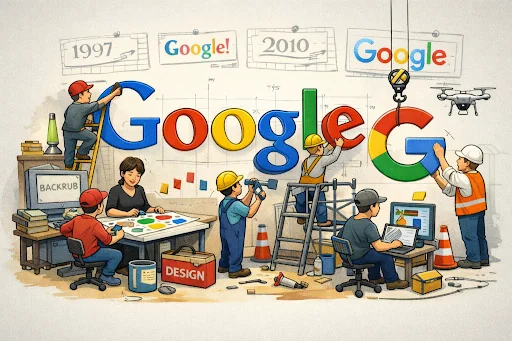
What Was the First Google Logo?
Before Google became Google, it started as a research project called Backrub at Stanford University in 1996. The name came from the idea of analyzing “backlinks” to understand the importance of web pages—something revolutionary at that time. During the Backrub phase, there was no serious branding effort. The project needed a simple identifier, not a polished logo meant for the public.
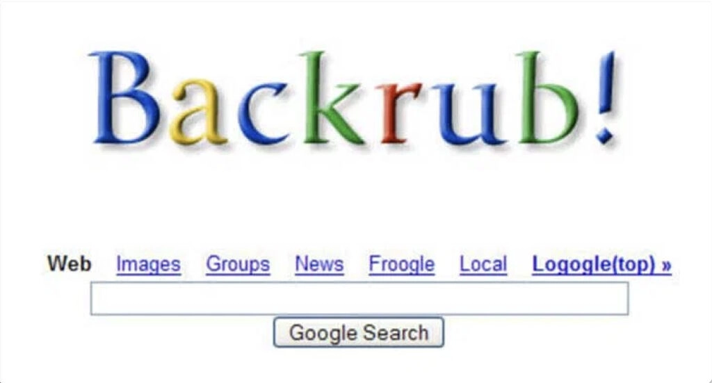
When the project was later renamed Google, a misspelling of the mathematical term Googol, meaning the number one followed by 100 zeros, the founders needed a basic logo to represent the new name.
This is when the first Google logo appeared. It was created by Larry Page himself using basic graphic tools. The design was a straightforward text logo with multiple colors and an exclamation mark inspired by Yahoo’s branding.
Google was officially founded in 1998, but this early logo phase reflected its Backrub roots—experimental, academic, and unconcerned with visual perfection. The purpose was simple identification, not branding. This Backrub-to-Google transition laid the groundwork for future logo refinements, where design would begin to reflect Google’s growing ambition and long-term vision.
Who Designed the Google Logo?
Ruth Kedar played a defining role in shaping the Google logo into what the world began to recognize in the late 1990s. While Larry Page created the very first experimental logo himself, it was Ruth Kedar, a design instructor at Stanford University, who designed the first widely recognized and professionally refined Google logo.
When Larry Page and Sergey Brin approached her, Google was still a young startup with a bold vision. Kedar immediately sensed that this was not just another tech project. Instead of following popular design trends, she focused on creating something timeless, friendly, and approachable.
Her goal was to make a search engine feel less intimidating at a time when many people were still unsure about using the internet.

Recommended Professional Certificates
Digital Marketing Mentorship Program
Advanced AI Marketing Bootcamp
Performance Marketing Bootcamp
SEO Specialist Bootcamp
The Design Philosophy Behind Google Logo
Ruth Kedar intentionally chose primary colors: red, blue, yellow, and green, to give the logo a sense of playfulness and curiosity. These colors reminded people of children’s building blocks, which aligned perfectly with Google’s purpose: helping users build knowledge by searching information.
One letter breaking the color pattern subtly conveyed that Google didn’t follow rules blindly, reinforcing its innovative spirit.
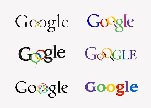
Google logo design explorations courtesy of Ruth Kedar
She also selected the Catull serif typeface, which balanced tradition with modernity. The font referenced classical typography while still feeling light and forward-looking. This choice reflected Google’s core idea of continuity—connecting past knowledge with present questions to shape future ideas.
Old Google Logo: The Early Years (1996–1999)
During its early years, the Google logo looked experimental and unfinished by modern standards. The design used a serif typeface with uneven spacing and strong drop shadows, giving the letters a slightly raised, three-dimensional effect. Bright primary colors—blue, red, yellow, and green—were already present, but they appeared inconsistent and loosely applied.
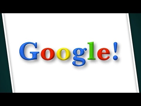
These early logos followed late-1990s web design trends, where shadows and bevel effects helped text stand out on low-resolution screens. The reason the logos were basic was simple: Google was focused on building a superior search algorithm, not on branding.
Design decisions were quick and functional. The logo’s job was visibility, not storytelling. Still, these early versions quietly introduced the playful color palette that would become central to Google’s identity.
History of Google Logo
Below is the history of the Google logo:
1996–1998: Experimental and Founder-Created Logo
In the earliest phase, Google’s logo was purely experimental. Created by Larry Page, it reflected a startup learning by doing. The serif font, colorful letters, and exclamation mark showed influence from existing tech brands, especially Yahoo.
There was no consistency in spacing or styling. The purpose of this logo was identification, not brand building. This phase matters because it shows Google’s humble beginnings and willingness to experiment before settling on a clear visual direction.
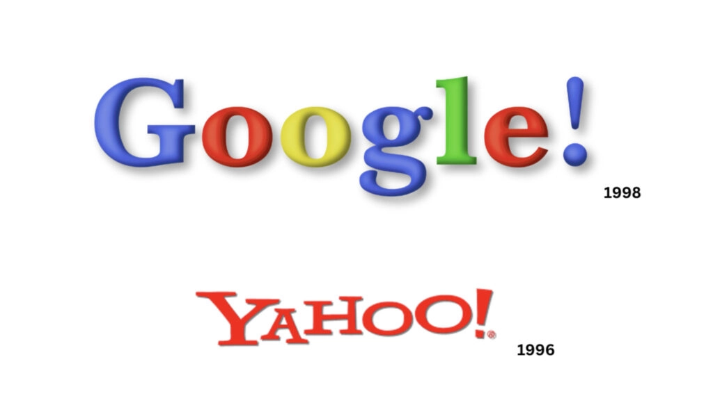
1999: Ruth Kedar Designs the First Recognized Google Logo
In 1999, Google took a decisive step toward professional branding. Larry Page and Sergey Brin worked with Ruth Kedar, a design instructor at Stanford University. Kedar designed the first widely recognized Google logo, one that balanced playfulness with credibility.
She refined the serif typeface, improved spacing, removed the exclamation mark, and introduced a more intentional use of primary colors. Her goal was to make a search engine feel accessible at a time when people were still cautious about the internet. The logo needed to feel welcoming, not intimidating.
This redesign marked Google’s shift from a student project to a serious company with long-term vision.
1999–2010: Stability and Brand Recognition
For more than a decade, Google retained the same core logo designed under Ruth Kedar’s influence. Changes during this period were subtle—lighter shadows, cleaner edges, and improved color consistency.
This stability played a crucial role in building trust. As Google expanded globally and became the default search engine for millions, a familiar logo reinforced reliability. The purpose of not changing the logo dramatically was clear: recognition mattered more than reinvention during rapid growth.
Read More Marketing Guides
| Digital Marketing Funnel | Future of Digital Marketing |
| Benefits of Digital Marketing | Latest Digital Marketing Trends |
| Digital Marketing Channels | Digital Marketing ROI |
2010: Reducing Depth for Modern Screens
In 2010, Google updated its logo by softening shadows and simplifying visual depth. The design moved closer to a flat appearance, improving clarity on high-resolution displays. This change was driven by technology, not aesthetics. Screens were changing, and the logo needed to remain crisp and readable. The update respected the existing identity while quietly modernizing it.
2013: Transition to Flat Design
By 2013, Google removed most remaining gradients and 3D effects. The logo became cleaner and flatter, aligning with modern interface design trends. This mattered because Google products were increasingly used on mobile devices and apps. A simpler logo ensured consistency across platforms and improved performance on smaller screens.
2015: The Most Significant Redesign
In 2015, Google introduced its biggest logo change. The traditional serif typeface was replaced with a custom sans-serif font designed for digital environments. The new logo was geometric, scalable, and optimized for a mobile-first world.
This redesign reflected Google’s evolution from a search engine into a full ecosystem of products. While the font changed, the playful color sequence—rooted in Ruth Kedar’s original philosophy—remained intact, preserving continuity.
2015–Present: Consistency With Purpose
Since 2015, Google has kept the same logo structure, making only minor refinements. This consistency signals brand maturity. The focus is no longer on redesigning the logo, but on using it flexibly across devices, animations, and products. Today’s Google logo represents simplicity, accessibility, and adaptability—values that have guided its evolution from the very beginning.
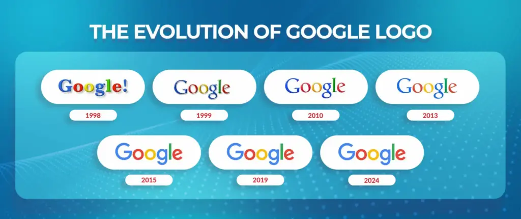
Google Logo History: Key Changes Over the Years
| Year / Period | What Changed | Why It Mattered |
| 1996–1998 | First experimental logo created by Larry Page with serif font and exclamation mark | Purely functional identity for a student research project |
| 1999 | First professional logo designed by Ruth Kedar | Established Google as a serious company with a friendly identity |
| 1999–2010 | Minor refinements in shadows, spacing, and colors | Built long-term trust and global brand recognition |
| 2010 | Reduced shadows and cleaner appearance | Improved readability on modern screens |
| 2013 | Shift toward flat design | Prepared the logo for mobile and app-based usage |
| 2015 | Major redesign with custom sans-serif font | Mobile-first, scalable logo for a multi-product ecosystem |
| 2015–Present | Minimal refinements, same structure | Shows brand maturity and consistency |
Upcoming Masterclass
Attend our live classes led by experienced and desiccated instructors of Wscube Tech.
Google Logo Evolution: Visual and Design Shift
The visual evolution of the Google logo is a story of simplification. In the early years, the logo relied on shadows, gradients, and serif styling to stand out on low-resolution screens. As technology improved, these elements became unnecessary and even distracting. Google gradually moved toward flatter design, cleaner edges, and better spacing to ensure clarity across devices.
The biggest visual shift came in 2015, when Google adopted a fully modern look optimized for phones, tablets, and smart devices. The logo became lighter, more geometric, and instantly adaptable. Despite these changes, Google preserved its iconic color order, ensuring familiarity. This balance between change and continuity is what makes Google’s logo evolution effective rather than disruptive.
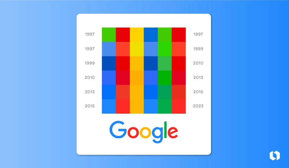
Google Logo Font
In its early professional years, Google’s logo used a serif typeface called Catull, chosen by Ruth Kedar. This font blended classical typography with modern lightness, reflecting Google’s purpose of connecting past knowledge with future ideas. The serif style added credibility at a time when people were still unsure about trusting the internet.
In 2015, Google replaced Catull with a custom sans-serif font designed specifically for digital screens. This font improved readability, scalability, and consistency across platforms. The shift from serif to sans-serif symbolized Google’s transition into a mobile-first, technology-driven brand, while keeping the logo friendly and approachable.
Why Does Google Keep Updating Its Logo?
Google does not change its logo for cosmetic reasons. Each update reflects a shift in how people use technology. As screens moved from desktops to mobiles, and from websites to apps, the logo needed to adapt. Flat design improved performance, clarity, and consistency across environments.
Another reason is brand expansion. Google is no longer just a search engine; it is an ecosystem of products. The logo must work equally well on smartwatches, phones, TVs, and future devices. Small updates help Google stay modern without losing recognition or trust.
Google Doodles vs Google Logo
The Google logo and Google Doodles serve different purposes. The main logo represents brand identity and remains consistent. Google Doodles are temporary variations that celebrate events, people, and milestones.
Doodles do not replace the logo; they sit on top of it. Even when heavily illustrated or animated, the core Google identity is preserved. This approach allows creativity without compromising brand consistency.
Lesser-Known Facts About the Google Logo
- The original logo included an exclamation mark inspired by Yahoo
- Primary colors were chosen to reduce fear around early internet use
- One letter intentionally breaks the color pattern to show innovation
- The logo was designed to feel playful, not childish
- Ruth Kedar’s design lasted over a decade with only minor tweaks
- The 2015 redesign focused more on function than appearance
- The logo is designed to animate smoothly across devices

FAQs About Google Logo History
The first Google logo was a basic text-based design with multiple colors and an exclamation mark. It was created using simple graphic tools and had no professional branding strategy behind it.
The first widely recognized and professionally refined Google logo was designed by Ruth Kedar, a graphic designer and Stanford design instructor.
The primary colors were chosen to make Google feel friendly, playful, and approachable. The colors helped reduce fear around early internet use and made technology feel more human.
In the early years, Google focused on building its search technology rather than branding. The logo’s main purpose was identification, not long-term visual storytelling.
The biggest change occurred in 2015 when Google replaced its serif font with a custom sans-serif font designed for digital and mobile screens.
The 2015 redesign was driven by a mobile-first approach. Google needed a logo that worked smoothly across phones, tablets, apps, and smart devices.
Before 2015, Google used a serif typeface called Catull, which balanced traditional typography with a modern feel.
Today, Google uses a custom sans-serif font created specifically for digital clarity, scalability, and consistency across platforms.
Explore Our Free Courses





Leave a comment
Your email address will not be published. Required fields are marked *Comments (0)
No comments yet.